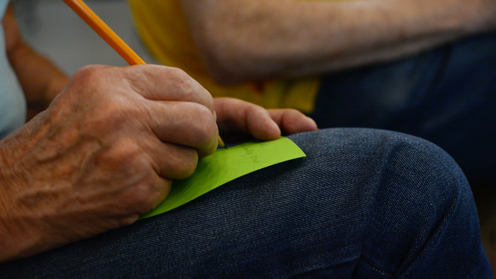
"I'm not sure if that's right..." He expanded,
“the things I suggested - I’m not sure if they are the right design answers for those problems.”
The gentleman had participated in a workshop with AzuKo at Tate Britain as part of the museum's Soapbox series, "for people near or beyond the age of 60 to meet up and share views on life and art through topical discussion and debate".
The Public Programmes team at Tate hired us to design and facilitate the July edition of Soapbox - Who are museums created with? (Though we were quickly informed by one of the participants that museums are where dead elephants and historical artefacts are housed and galleries are where art is presented. A common mistake, she reassured us.)
The man was unsure about the recommendations he had made about the signage design for one of the galleries. He suggested that the intention of the room should be communicated better and that the signage be designed in a way that was more welcoming and informative.
He was critical, he had a point of view and he was confident about the types of design changes that could make the space more user friendly. Nevertheless, he was uncertain about his voice as a designer.
We asked the group to explore and observe the galleries and speak with other visitors about the current experience at Tate Britain. We prompted them to challenge how participatory the spaces currently are, and why that was relevant.
When we spoke with the group about their observations and their conversations it was immediately apparent that the discussion was a voicing of design perspectives on how the museum could be more welcoming, more useful and how it could support a better experience.
We were inspired by the diversity of ideas they put forward, despite only having half an hour to complete their task. They touched on:
Particular aspects of the galleries that aren't culturally relevant for foreign visitors
Importance of communication and signage in the space and the ineffectiveness of some signage in the galleries and the Common Ground community garden. The size, messages, colours and coordination were all discussed.
Learning styles that should be considered which would affect the nature of the experience e.g. extroverted and introverted personalities will experience the space differently
Insights about the user experience - some staff have the opportunity to participate in the experience of the museum unlike roles such as Security, spatial curation could be better and certain rules in the space didn't work for their age group e.g. no sitting on the temporary exhibition which has several spaces to seemingly sit
Seasonality and planting in the Common Ground garden, and how it could have been more collaboratively created
Children offer their own perspective (a mindset and from the floor) on the art in the museum; a relevant perspective
The man's comment after the workshop is telling. It highlights to us the hierarchy inherent in the world of design and, more importantly, the nature of education in our society. Of course he was correct - he was also incorrect - there is no right design for the museum which would meet the needs of all users at Tate Britain.
What was most impressive about the session, was that despite any doubt the group had about their age, their lack of training as designers or the subjectivity of the 'right' design, in just two hours the group united around a task and over-delivered an assembly of relevant design voices that Tate couldn't ignore.
Learn more about our public workshops and events.
Author: N. Ardaiz


